COVID-19 Viz
visualization design (2020)
This is a series of visualization design related to the on-going COVID-19 pandemic. The project started in January 2020 in collaboration with Peking University Visualization and Visual Analytics Group, aiming to help the public gain a better understanding of this global health crisis. The first design – Visual Squares - was published shortly after Wuhan's lockdown. The project site has been updated in near real-time fashion, and attracts high traffic daily.
This series is part of Peking University's collection of COVID-19 Visualization and Visual Analytics.
Created by:
Rebecca Ruige Xu
Sean Hongsheng Zhai
Software:
P5.js, D3.js, Python
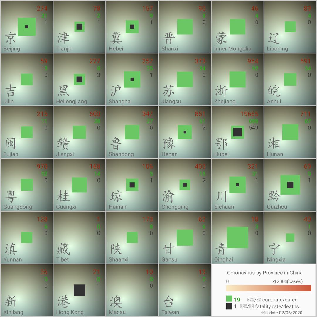
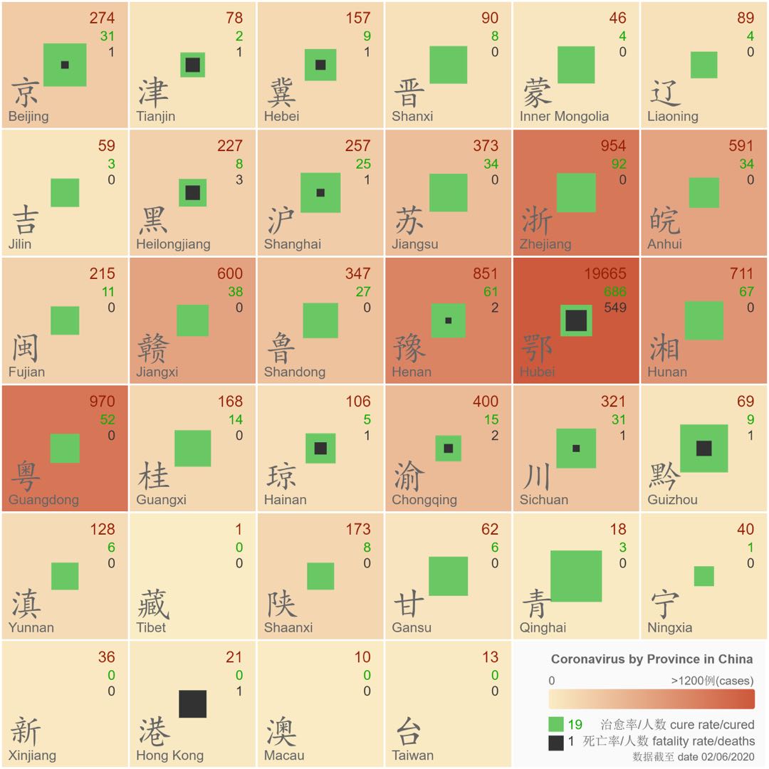
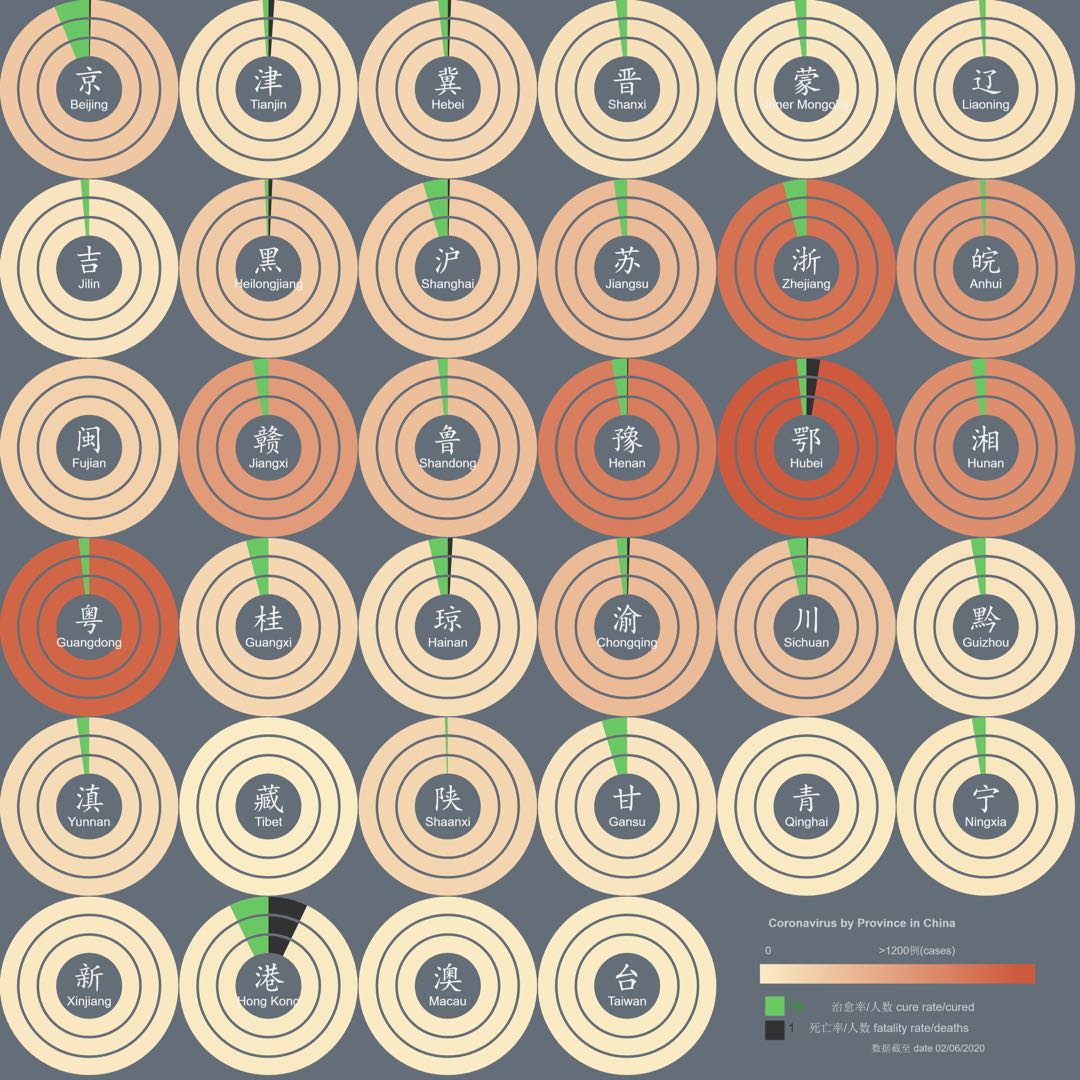
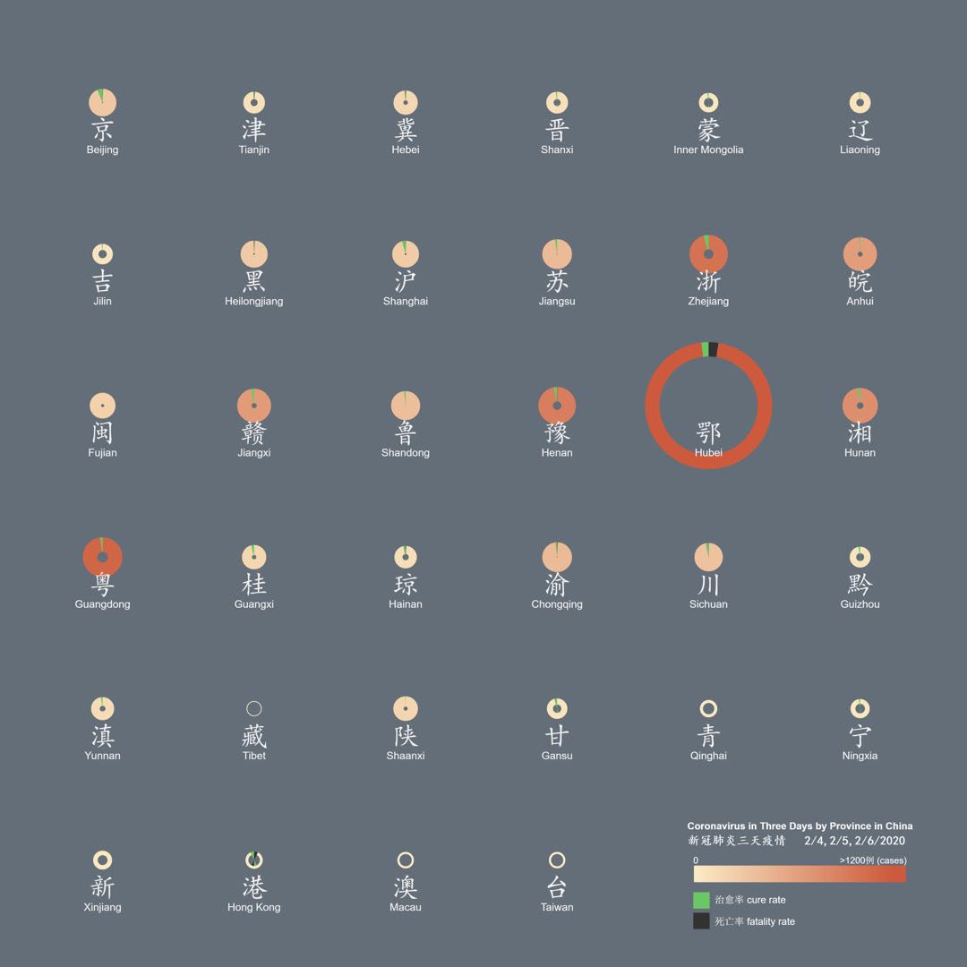
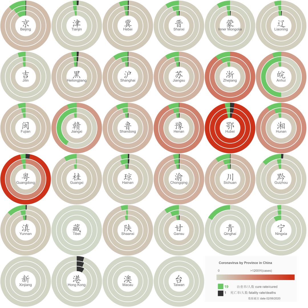
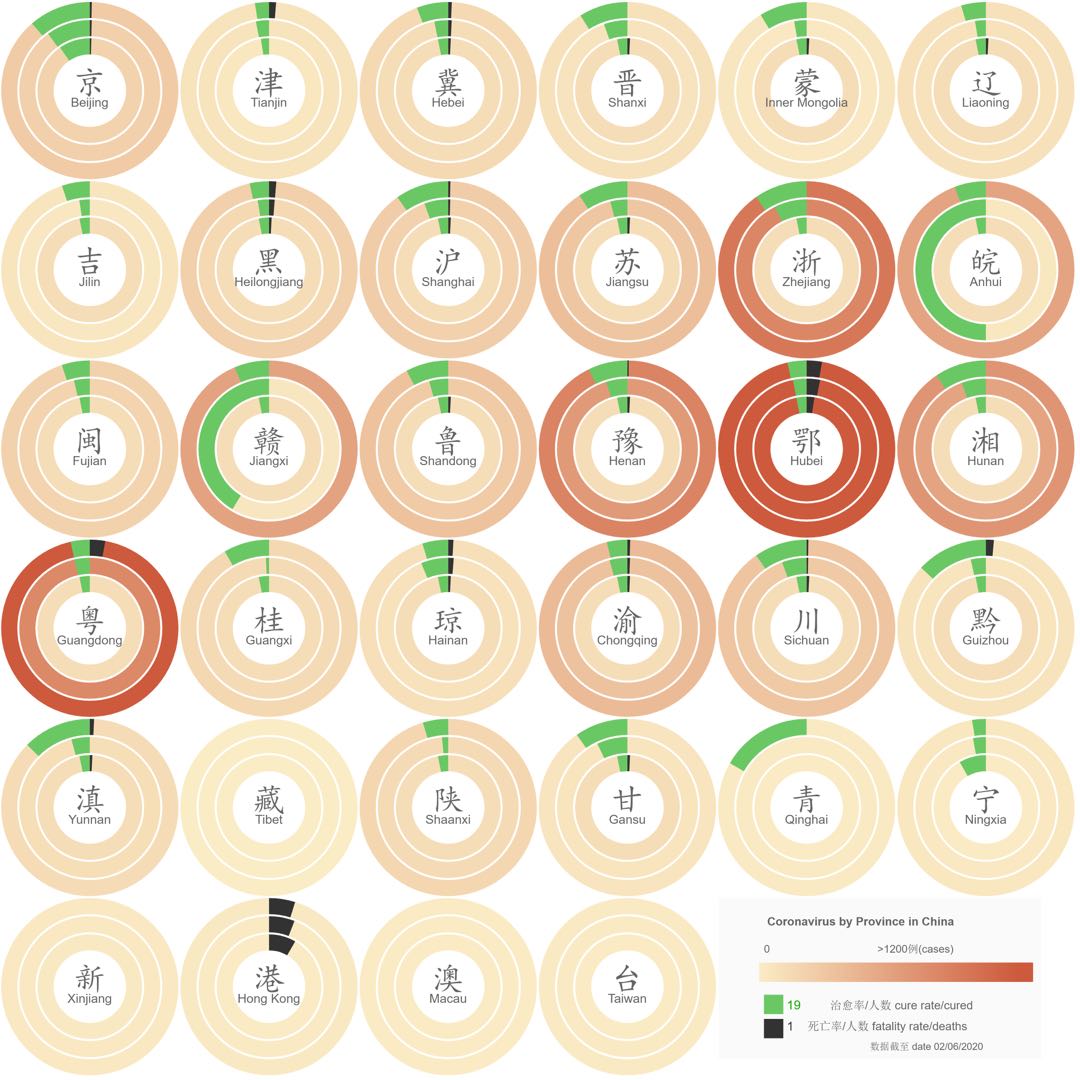
Visual Squares
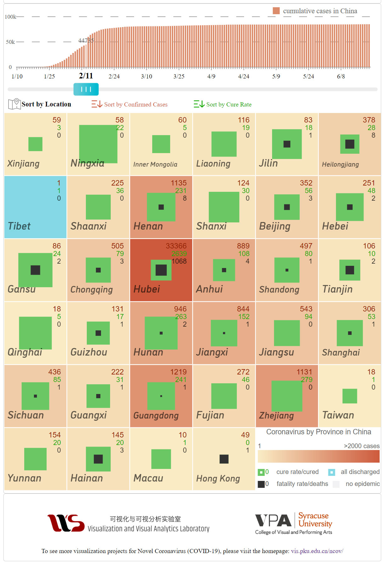
The project Visual Squares was initially published in February 2020, shortly after the coronavirus broke out in Wuhan. At the time, there was tremendous fear in the Chinese public caused by this newly discovered and highly infectious disease. To many, the latest outbreak bears eerie similarities of the 2003 SARS epidemic and has brought back painful memories. My goals in Visual Squares are to provide the public with a better understanding of the overall situation in each region, to lessen people's fear and anxiety caused by the sharply rising of infected cases and the growing number of deaths, and even possibly supply a positive outlook.
Within each square, the numbers of total cases, cured(in green), and deaths (in black) are represented, with a focus on the latter two. When viewing this visualization over a period of time, the battle of humans against the coronavirus was reflected in the ratio changes of the areas of green over black. Observing green progressively gaining more ground clearly stated the fact that the coronavirus was being effectively contained in China, which helped people to gain more confidence and stay calm. We can foresee that each visual square will eventually be dominated by the green of survivors, and the lost lives in black are marked in the center forever.
To visit the live sites:
International Version
China Version
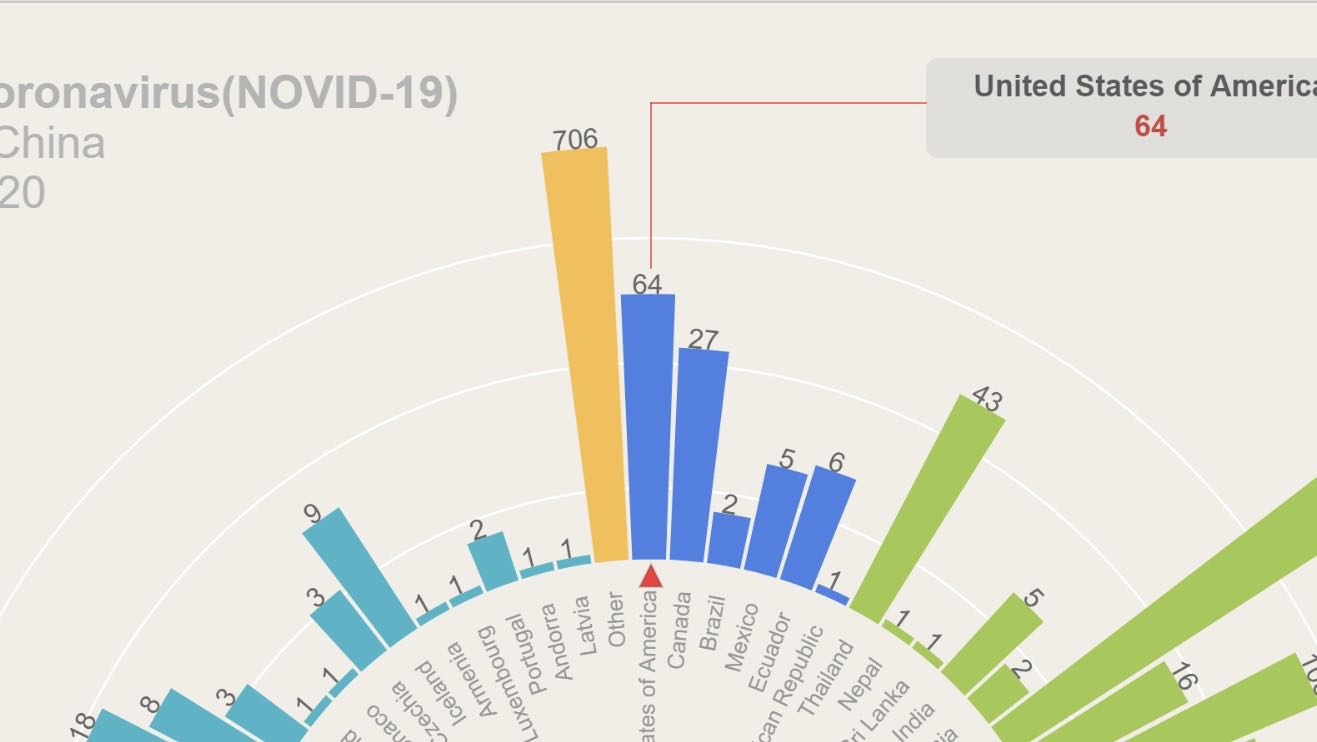
Global Situation
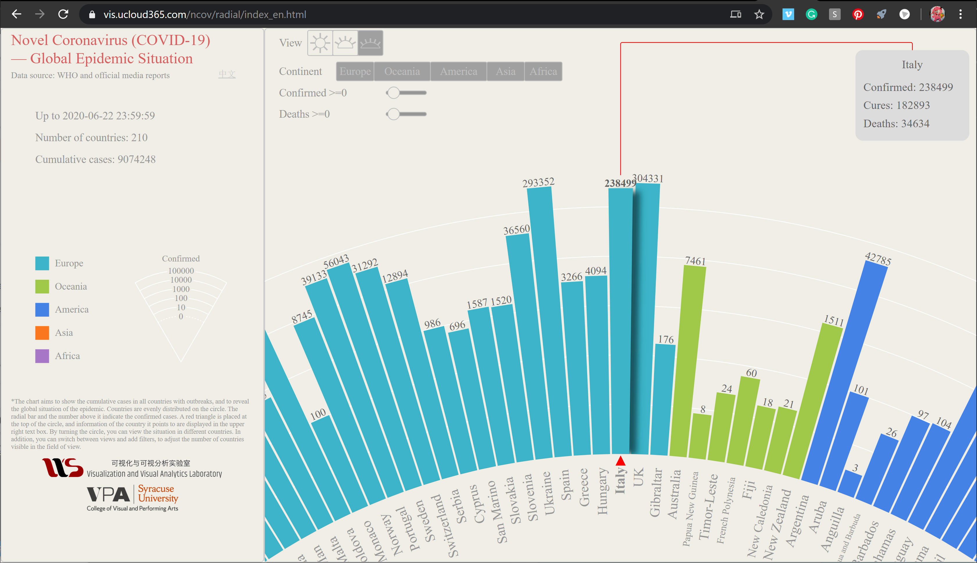
The chart aims to show the cumulative cases in all countries with outbreaks, and to reveal the global situation of the epidemic. Countries are evenly distributed on the circle. The radial bar and the number above it indicate the confirmed cases. A red triangle is placed at the top of the circle, and information of the country it points to are displayed in the upper right text box. By turning the circle, you can view the situation in different countries. In addition, you can switch between views and add filters, to adjust the number of countries visible in the field of view.
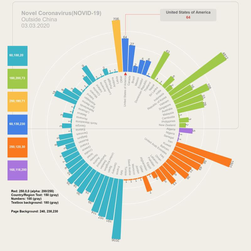
To visit the live site, click here
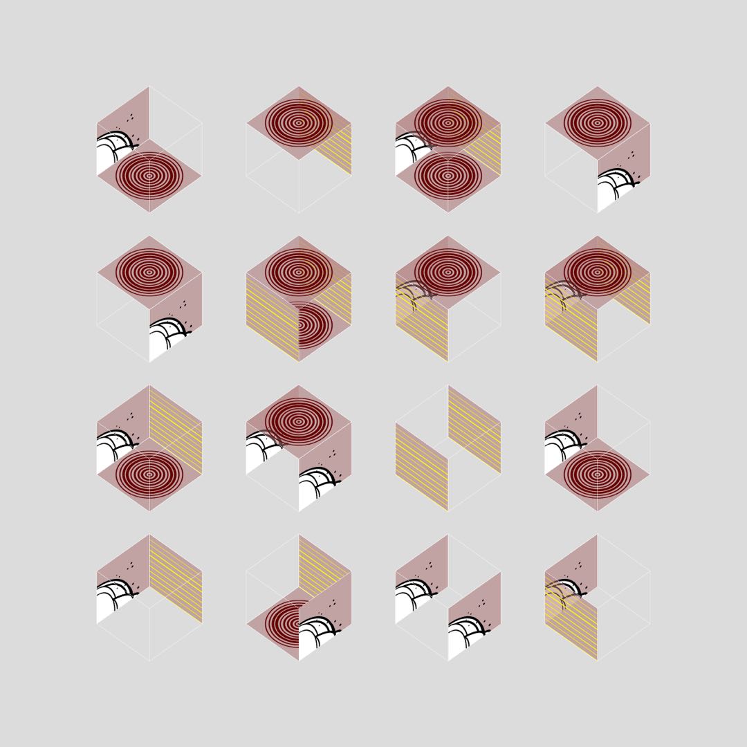
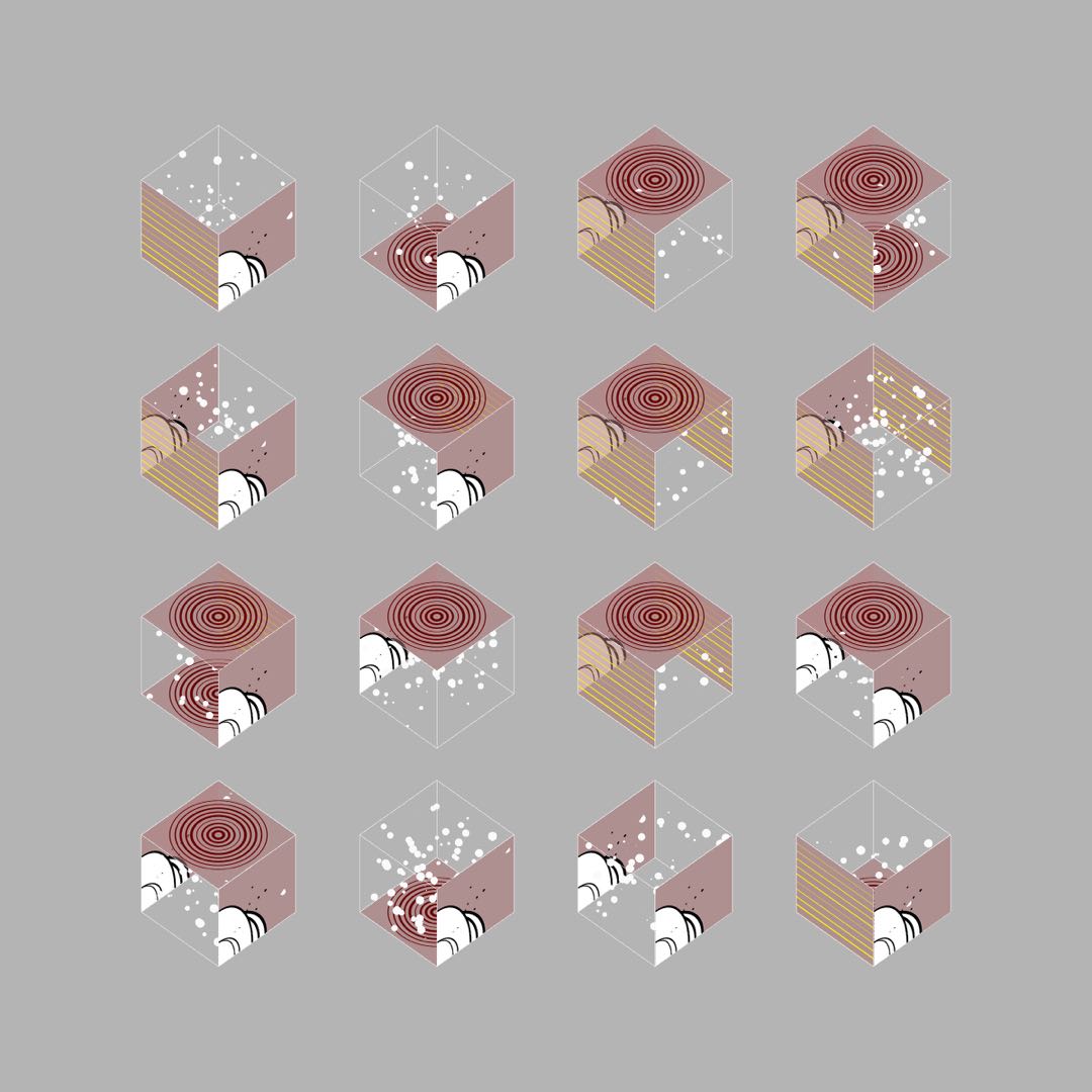
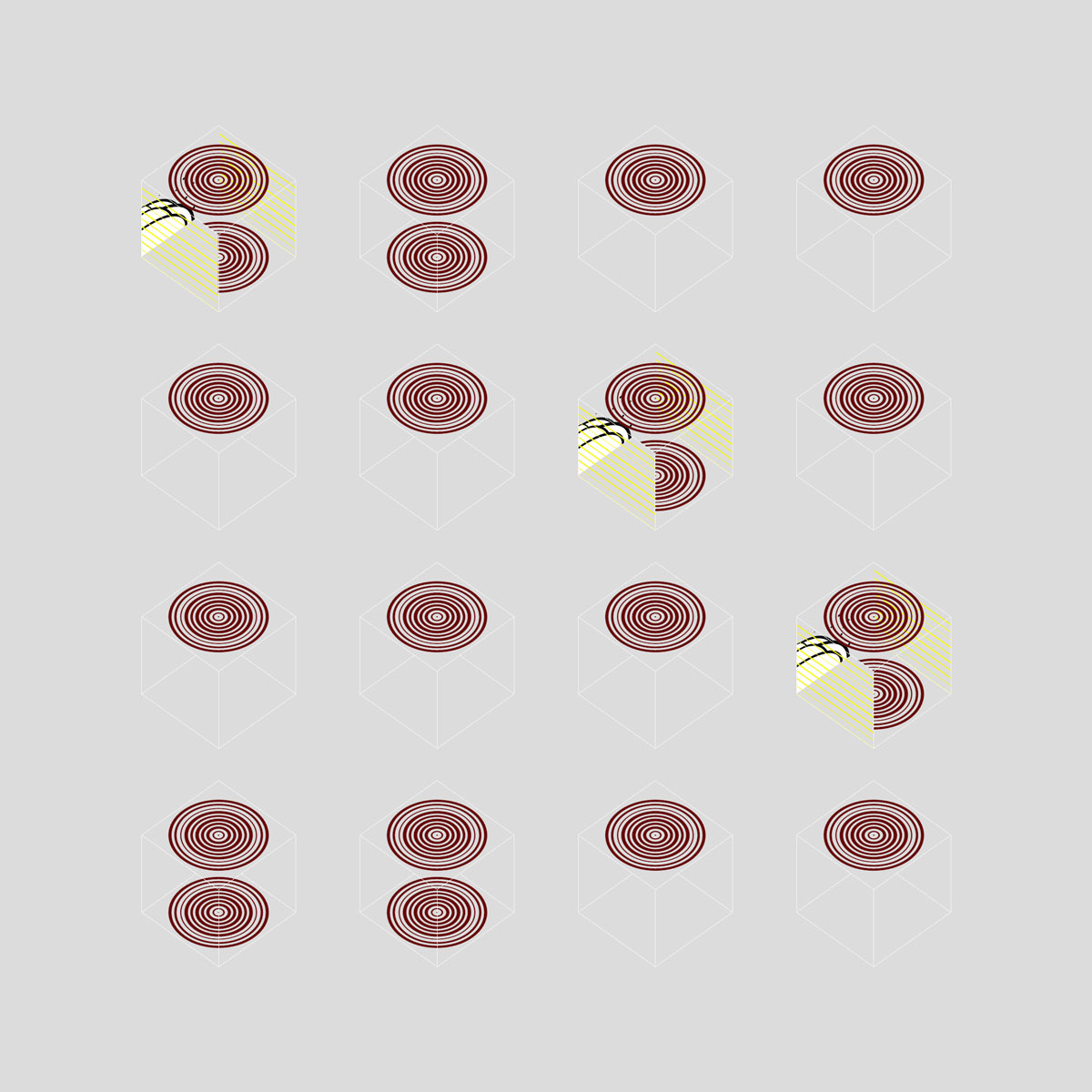
Stories in (Social) Distance
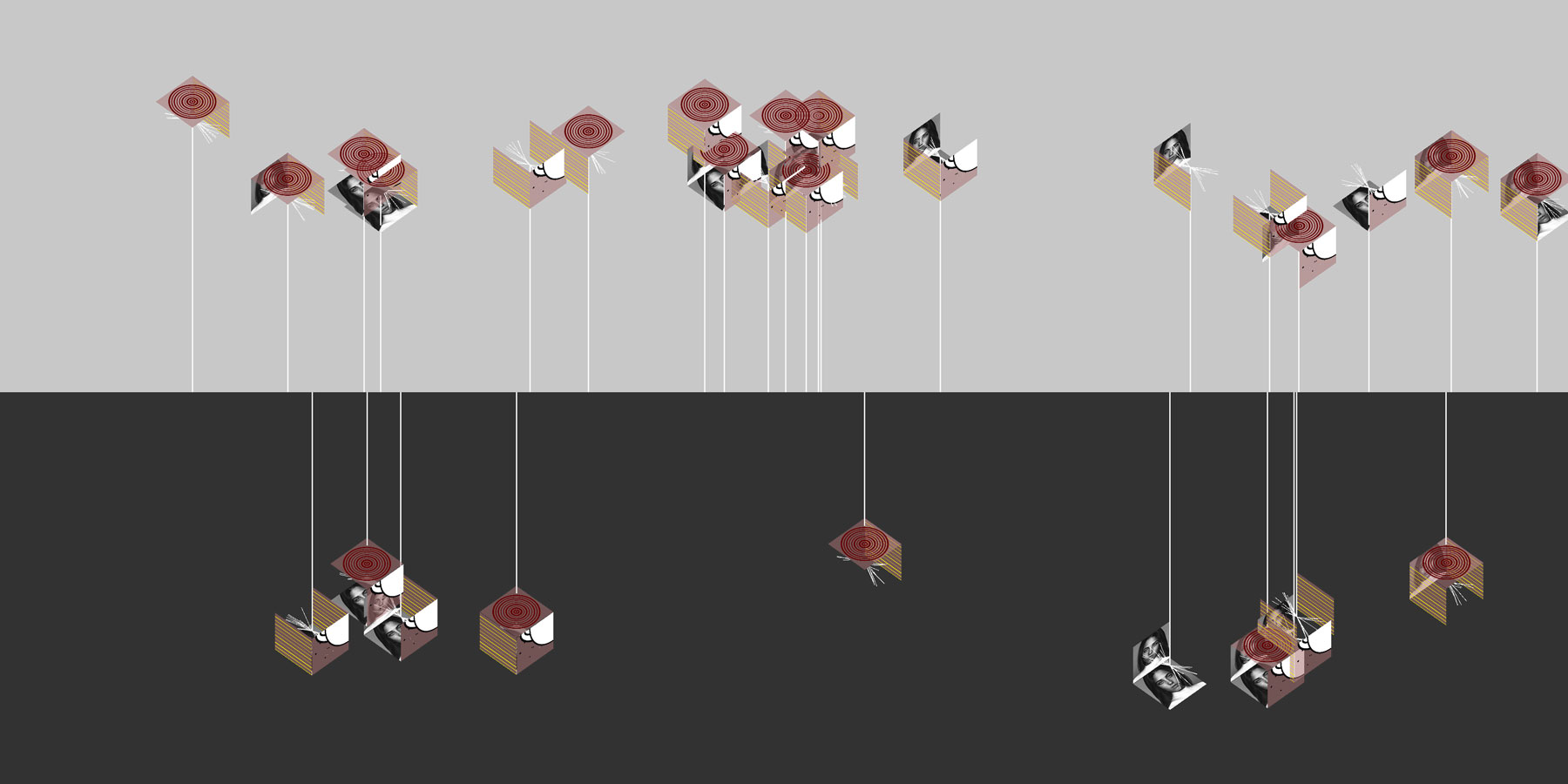
Covid-19 re-defines the perception of space and distance, perhaps it will change people's behavior forever. The isolcated graphics are created to capture the lonesomeness, even there are so much similaries between different people, sharing and communicating has become different.
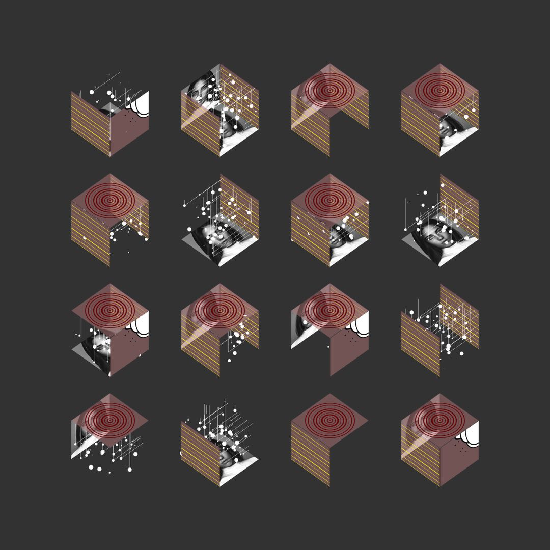
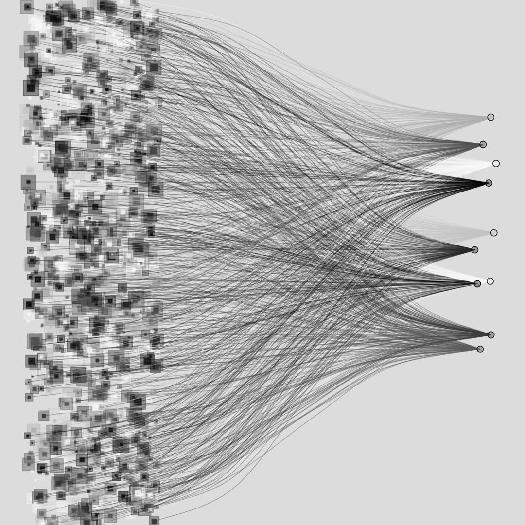
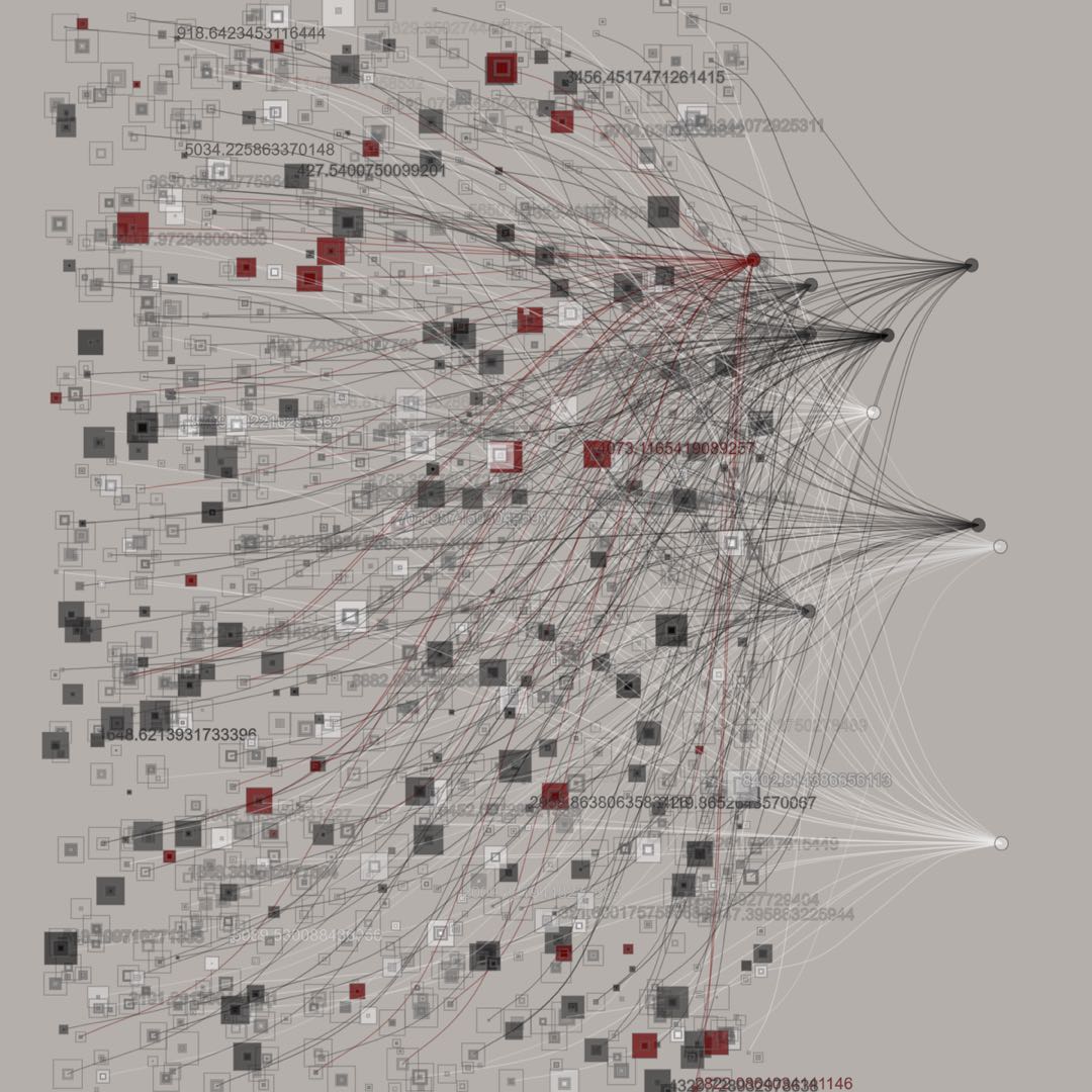
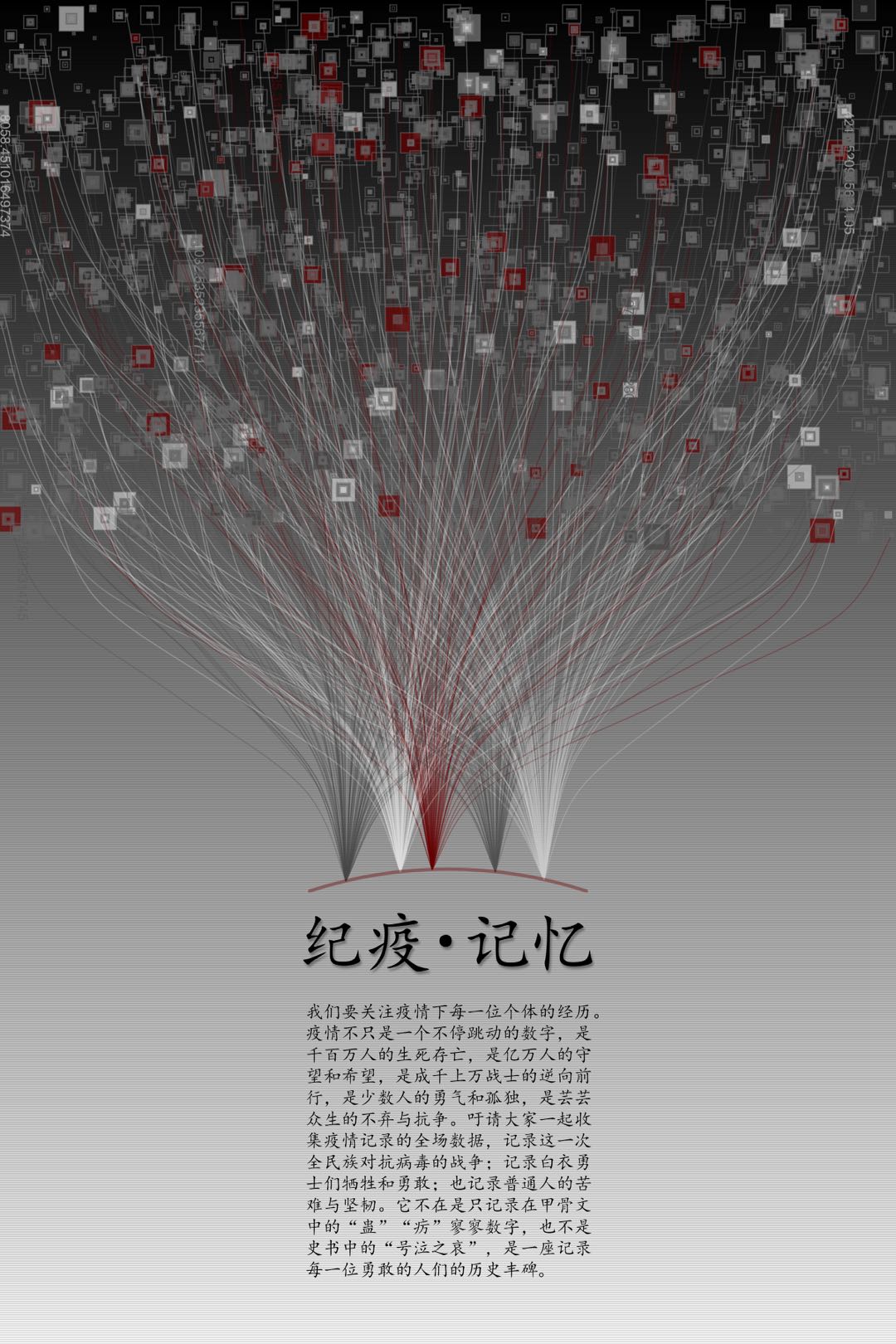
Memories of Pandemic
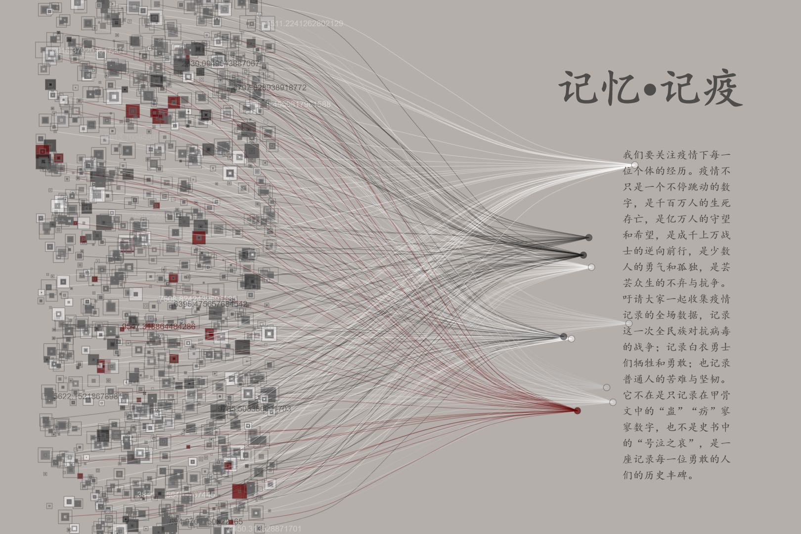
This is a design of an ongoing effort to collect stories about people who have gone through Covid-19. The stories can be about oneself, her/his friend of family, and the system just serves as a place to hold a piece of memory, silently and honestly, as a mark to keep the moment.